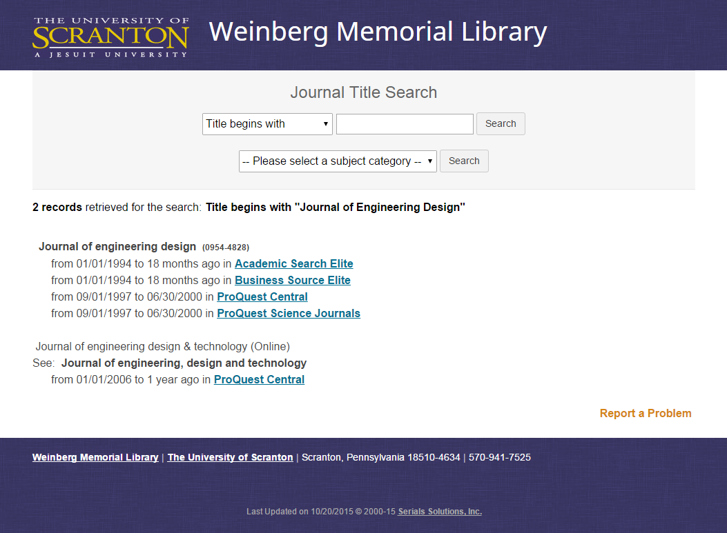
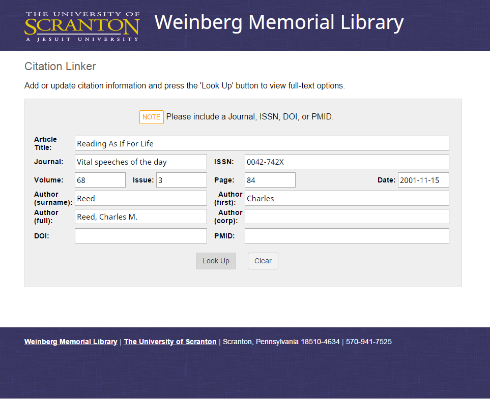
Journal Search Pages Update
The library’s Journal Search pages (and the related Citation Linker) were badly in need of an update. From their appearance, I’d estimate that they were designed in the early 2000s (and I’m being generous). Part of the reluctance to update the styles was due to the fact that, for some reason, changes to the Serials Solutions platform only go live once a day. There is no way to make a change and test it, and then iterate until you get what you want. (So in a way it prevents cowboy coding, but because there is no test server or development environment, and you’re modifying an existing system with existing styles that need to be overriden, there’s also no good way to make a reliable mockup.)
Let’s take a trip back to, say, 2003 …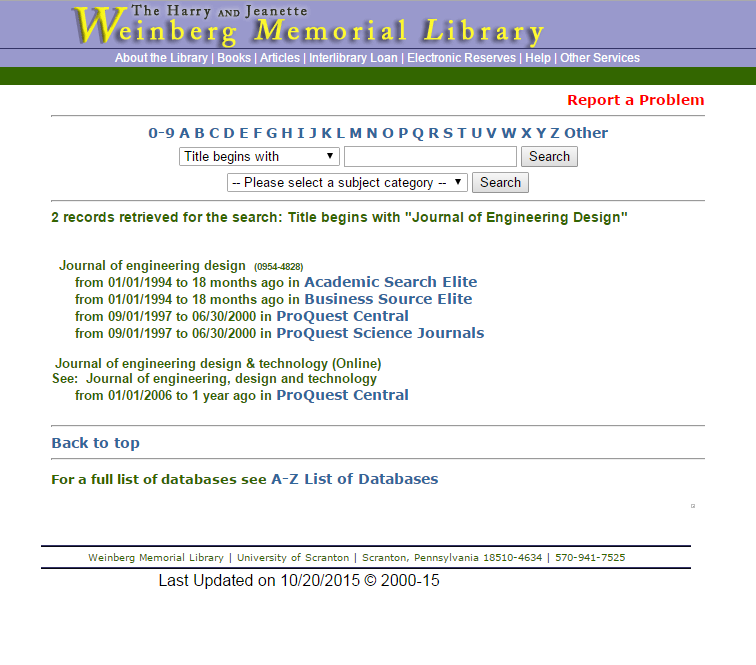
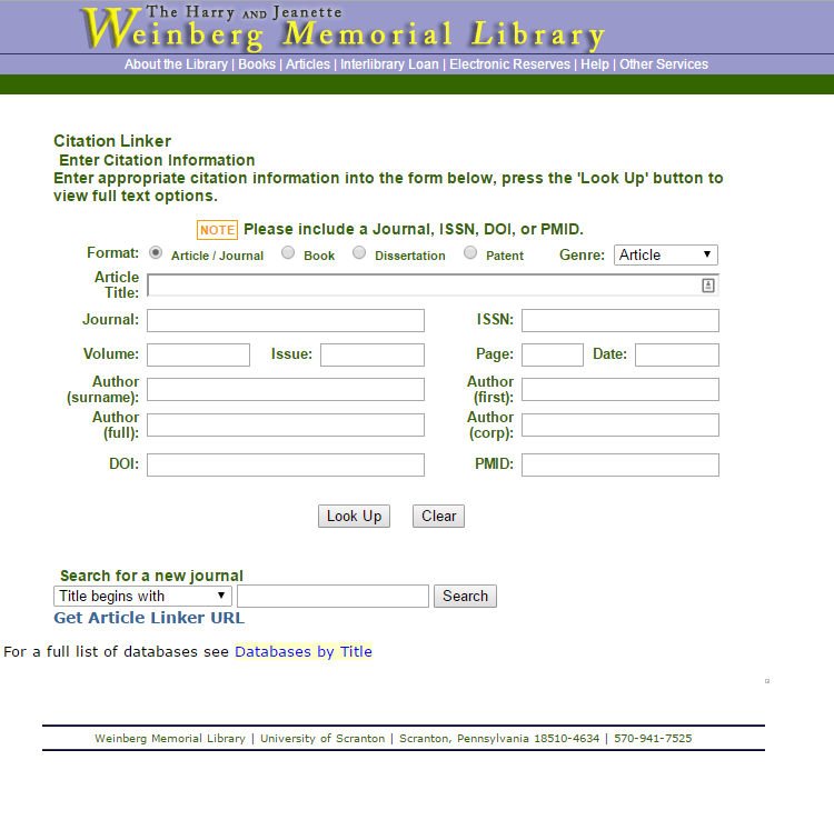
It got to the point, as you can imagine, where I couldn’t stand to look at the pages. The pastel color scheme and obnoxious JavaScript dropdown menus were, frankly, an embarrassment. It was time to take on the challenge of a redesign.
First I polled the Reference librarians, who are some of the most frequent users of the journal search pages. I asked:
- Do the pages need titles? What are the cases in which someone could come to this page out of context and be confused as to what it is? The tab title is currently “Full Text Electronic Journal List.” In any case, this should probably be changed.
- Do we need the A-Z links?
- Do we need the “search titles” index? I already took the liberty of switching over to page numbers, which is at least as useful and much less cluttered.
- Is the “Get Article Linker URL” link useful? Keep in mind that it links only to the results page and not to any particular article.
- What about the randomly-placed “Search for full-text journals” at the bottom of the Citation Linker form and search results?
Compiled responses, among others, were:
- Use the title “Periodicals Search” to match my.scranton (this was eventually voted down based on the language currently used in bibliographic instruction classes, but we may revisit it)
- No; remove. They are not useful because there are hundreds of journals beginning with each letter, so it’s a very inefficient way that no one would use to search. Also, the results are paginated, so there isn’t even a way to bring up a complete list of titles beginning with a particular letter and use the browser search function to find the journal.
- Page numbers are much more useful
- Not useful; remove
- Not useful; remove
This was a great help in determining what functionality we needed to keep, what should be emphasized for ease of use, and what is useless clutter and could be removed. The librarians also helped a lot with the choice of wording for the labels and titles to make them consistent with what they teach in information literacy courses.
Next, I experimented with colors and styles to build a clean, minimal, easy-to-navigate site that uses colors and other branding elements consistently with our library home page, University portal, and other aspects of our public-facing web presence. Changes were made in the Serials Solutions/360 client.
The header and footer are clean and simple:
Header
<div id="wrap">
    <div id="header" style="background-image: url(https://www.scranton.edu/academics/wml/images/serials-solutions-background.png);">
        <div id="logo">
            <img src="https://www.scranton.edu/global/images/scranton-logo.jpg"> <span id="name"><a href="https://scranton.edu/library/">Weinberg Memorial Library</a></span>
        </div>
    </div>

<div id="main">
Footer
        </div>
    </div>
</div>
<div id="footer">
    <p class="contact-info"><a href="https://www.scranton.edu/library">Weinberg Memorial Library</a> <span class="divider">|</span> <a href="https://www.scranton.edu/">The University of Scranton</a> <span class="divider">|</span> Scranton, Pennsylvania 18510-4634 <span class="divider">|</span> 570-941-7525</p>
</div>
The styling comes from a single css file—just style to your liking. I added the following to override some of the built-in features that the librarians did not want to see on our pages:
/***************************
  Hide Format/Genre options
***************************/
.RefinerRow {
  display: none;
}
.RefinerRow ~ .RefinerRow { /* But display next instance of .RefinerRow class */
  display: table-row;
}
/*********************************************
  Hide journal search form at bottom of page
*********************************************/
div.SS_NoResults, div.SS_NoResults + div.searchForm {  /* Citation linker search form  */
  display: none;
}
td.SS_Text, div.searchForm  {  /* Citation linker results view  */
  display: none;
}
2015 version of the Journal Title Search page and Citation Linker form
